
Your ads get clicks. The phone doesn't ring.
You check the ad. The wording looks fine, the budget is spending, people are clicking. So you tweak the ad again.
But if every click lands on your homepage, the ad probably isn't the problem. The page is.
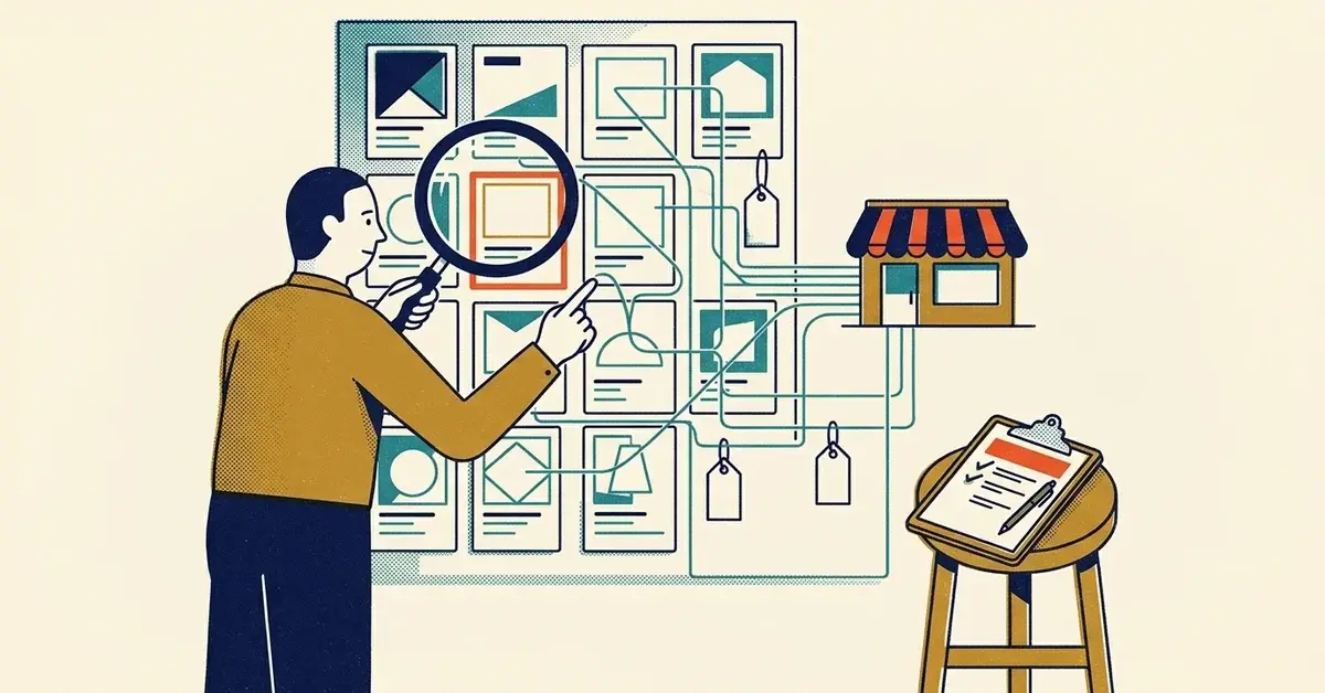
A homepage is built for everyone. An ad click is one person with one specific need, right now. Hand that person a page with ten menu items, your company history and four services they didn't ask about, and most of them will skim, get lost and leave.
You paid for that click.
The quick answer
- Pick your best-performing ad (or the one with the most spend).
- Build one page for it: a headline that repeats what the ad promised, three benefits, real proof, and one button.
- Point that ad's final URL at the new page instead of the homepage.
- Track form fills and calls for two to four weeks and compare cost per lead with what the homepage gave you.
One catch. As of November 2026, if the campaign uses AI Max for Search, Google turns on Final URL expansion by default, and Google Ads Help says it "may replace your Final URL with a more relevant landing page based on the user's search query." That can send clicks right back to your homepage. Turn it off in the campaign settings, or add your homepage as a URL exclusion.
That's the whole fix. The rest of this post is how to build the page well.
How to tell if your homepage is the leak
Open your ad on your phone, click it, and look at what loads. Then ask:
- Does the first screen say the same thing the ad said? If the ad says "Roof leak repair" and the page says "Welcome to Smith & Sons, serving the community since...", that's a mismatch.
- Can you see the next step without scrolling? A button or form, not just a menu.
- How many places can you click? Count them. A homepage usually has a dozen or more.
- Does it load fast on mobile data? Turn off Wi-Fi and try.
Then look at your numbers. In your ad platform, a good click-through rate with very few conversions usually means people liked the ad and lost interest on the page.
Google measures this too. Google Ads Help lists landing page experience as one of the three parts of Quality Score: "How relevant and useful your landing page is to people who click your ad." Each part is rated Above average, Average or Below average against other advertisers who showed for the same search. Check it in your keywords view. Below average is a hint, not a verdict, but it's worth a look.
Why the homepage leaks
Homepages have a lot of jobs:
- explain the whole business
- introduce every service
- tell your story
- serve different audiences
- link to everything
That's fine for someone browsing. It's the wrong page for someone who clicked an ad about one problem.
Every extra option is a decision. Every decision is a chance to leave.
It costs you twice. You pay for the click that bounces. And Google says ad quality, which includes the experience once someone reaches your landing page, feeds into where your ad shows and what you pay: "Higher quality ads typically cost less per click than lower quality ads."
The rule that makes a landing page work
One offer. One audience. One action.
The page should match the promise of the ad and lead to one clear next step. If the ad says "Roof Repair Quote," the first thing on the page confirms that's exactly where they are.
The one-page blueprint
You don't need a designer for this. Most website builders (WordPress, Wix, Squarespace) let you add a page and hide it from your main menu. Six sections.
1. A "you're in the right place" headline
Say what you do, for whom, and where. Use the same words as the ad.
- "Roof Leak Repair Quotes for Augusta Homeowners"
- "Commercial Cleaning for Small Offices in Columbia County"
- "IT Support for Offices With Under 20 People"
Plain beats clever here.
2. Three benefits, not features
People don't care what tools you use. They care what gets easier for them. Only list what's true:
- you call back the same day
- you give a price range up front
- no long contract
- a real person answers the phone
3. Proof
This is the section that answers "Are you legit?"
- 1-3 real reviews, with the customer's permission
- before-and-after photos of your own work
- your license number or trade memberships, if your trade has them
- "Serving Columbia County since 2014" (only if it's true)
Real proof only. Invented or AI-written testimonials are a legal problem, not just a trust one; this post on turning real feedback into case studies covers what's allowed. If your business is new, proof matters even more, so lean on photos and specifics.
4. The offer
"Contact us" isn't an offer. Say what they get:
- "Get a Repair Quote"
- "Book a 15-Minute Call"
- "Schedule a Site Visit"
The button text should match the ad. If the ad offered a free inspection, the button says "Book My Free Inspection."
5. A short FAQ
Four to six questions that stop the hesitation:
- How soon can you come out?
- Do you serve my area?
- What does it usually cost?
- What happens after I fill out the form?
That last one matters more than it looks. People hesitate when they don't know whether a form means a phone call in five minutes or a sales sequence for five weeks.
6. The same button again
Repeat the call to action at the bottom. Same wording. No new options.
The biggest mistake: too many buttons
Trying to be helpful, a lot of pages end up offering everything:
- call us
- email us
- fill out the form
- chat now
- book online
- download a guide
- follow us on Facebook
Pick one main action. A second one is fine if it's clearly secondary, like a tap-to-call button on mobile when the main action is the form. Social links and the guide download can live on the homepage.
Good, better, best
You don't need a perfect page. You need one that beats your homepage for ad clicks.
Good: one page for your main ad. Headline, benefits, proof, form. This alone is a big step up.
Better: add the FAQ, a three-step "how it works," and a clear list of the towns you serve.
Best: one page per service you advertise, and per city if you run separate city campaigns. Each ad group points at the page that matches it.
What to track so you know it's working
A landing page isn't good because it looks good. It's good because it produces leads you can count:
- form submissions
- tap-to-call clicks
- booked appointments
- cost per lead in the ad platform
If you aren't tracking those yet, fix that first. Your ads aren't broken, your tracking is walks through the three things to set up. And send form fills to a real thank-you page, not a pop-up, so the conversion is easy to count (why the thank-you page matters).
Give it two to four weeks before you judge. A few days of data on a small budget is mostly noise.
If the new page still doesn't convert
Sometimes the page is fine and the offer is vague.
"Contact us for more info" asks the visitor to do the work. A better offer has:
- a clear outcome (a quote, an inspection, a 15-minute call)
- a time you can actually keep ("we'll call you back today" only if you will)
- a small first step (a 15-minute call feels easier than a "consultation")
The offer fix goes deeper on this one.
Preventing it next time
Make it a rule for whoever sets up ads: no new ad goes live without a matching page. Before launch, someone clicks the ad on a phone and checks that the headline, the offer and the button all say the same thing as the ad.
When to get help
If your page matches the ad, tracking is in place, and you're still paying for clicks that never turn into calls after a month, it's time for a second pair of eyes on the keywords, the offer and the page together. We're happy to look.
Related reading
- The Offer Fix: Why Your Ads Get Clicks but No Leads
- Your Ads Aren't Broken, Your Tracking Is: 3 Things to Fix
- Your Lead Form Is Hurting Your SEO: Why Bad UX Kills Conversions
Originally published February 2026. Updated November 2026.



No comments yet