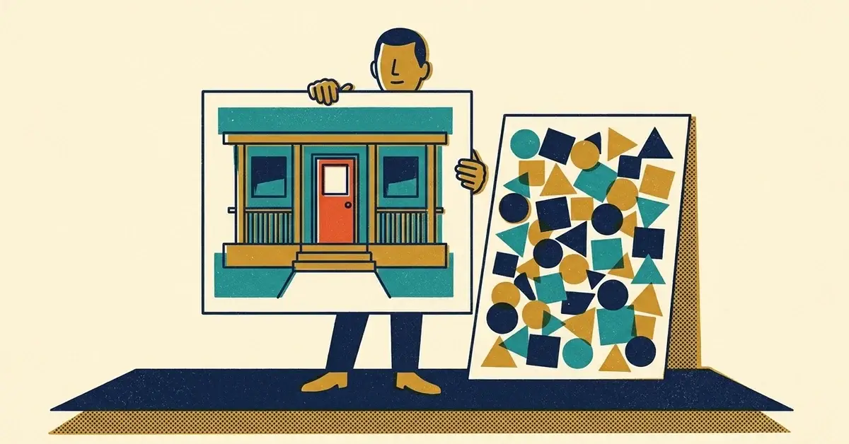
You made an ad image the way most of us would. Logo in the corner, phone number across the bottom, five services in a list, "Call Today!" in a starburst.
Then Google flagged it. Or it ran, and nobody clicked.
That image is trying to do the caption's job. On some Google ad formats it also breaks the rules. Here's what's allowed where, and what to put in the picture instead.
The quick answer
- Keep text, logos and buttons off the photo itself. Google doesn't allow them on Search image assets and advises against them on display ads.
- Upload your logo as a logo asset, not stamped on top of the image.
- Let the photo show proof: the finished job, the work in progress, your real team.
- Put the words in the headline and description, where they're readable and editable.
- Skip fake buttons, arrows and collages. Google treats them as misleading design.
- Make three images per offer and rotate them.
What Google allows, by ad type
The rules aren't the same everywhere, which is why this gets confusing. As of October 2026:
Image assets on Search ads
These are the pictures that can appear next to your text ads on Google Search. They're the strictest.
Google's image assets format requirements don't allow:
- "Images with text or graphic overlay including brand logos"
- images "collaged or combined together in post production"
- images with excessive whitespace, or where you can't tell what the product or service is
- blurry, distorted or badly cropped images
Logos or text that are part of the original photo are fine. Your sign on the shop front or the name on your van door is a photo of a real thing, not an overlay.
Search image assets also aren't open to every account. The same page lists the conditions, including an account open for at least 60 days, "a good history of policy compliance," and active text ads with Search spend in the last 30 days.
Performance Max
Performance Max is looser. Google's Performance Max image asset page says "You can use images with overlays," but recommends "at least one image without overlays for each aspect ratio."
So you can add text here. You still shouldn't lean on it. Performance Max builds ads in many shapes and sizes, and a headline baked into a photo gets cropped or shrunk in ways you can't control.
Display ads
Google's best practices for responsive display ads say "Avoid inserting text on top of an image," because "Overlaid text can be unreadable in smaller ad sizes." They also say:
- "Don't overlay a logo on top of an image, as this can be repetitive in certain ad layouts."
- "Don't add buttons to your image as they aren't a clickable element."
- "Blank space shouldn't take up more than 80% of the image."
These are best practices, not hard rules. But they're Google telling you what works in its own ad layouts.
Everywhere on Google
Two parts of Google's Misrepresentation policy catch homemade ad graphics:
- Misleading ad design. Google's policy doesn't allow "Download or install buttons or icons in image ads," "Moving and clicking arrows," "Images that are segmented," or "Images that look like more than one ad." A fake "Book Now" button drawn on the image counts.
- Clickbait. The clickbait policy doesn't allow "'before and after' images to promote significant alterations to the human body." Before-and-after of a kitchen or a lawn is a different thing. Before-and-after of a person's body or face isn't allowed.
Facebook and Instagram
Meta has its own Advertising Standards, and they're not the same as Google's. If you run the same images on both, check Meta's rules in Ads Manager before you launch, especially for anything health, beauty or body-related.
Where your logo goes instead
Your logo still belongs in the ad. Just not on the photo.
In Performance Max, the logo is its own asset. Google requires a square 1:1 logo (1,200 by 1,200 pixels recommended, 128 by 128 minimum) and allows an optional wide 4:1 one. It also warns that "Logos with a transparent background may be rendered on a white background," so a white logo on a transparent background can vanish.
On Search, your logo and business name are separate business information assets. Google's help page says they need advertiser verification and recent Search spend, and even then they "are not guaranteed to serve." When they don't, Google shows a placeholder globe icon. This post explains the globe.
Five visuals that work without a logo
1. Before and after (of the work)
The fastest proof there is. Left side broken, right side fixed. A clogged gutter and a clean one, a cracked screen and a new one.
Two notes. Use two separate photos taken from the same spot, rather than a split-screen collage, for Search image assets, since post-production collages aren't allowed there. And keep people's bodies out of it.
2. Hands doing the work
No perfect before-and-after? Show the job in progress. Your hands, your tools, one real step of the process.
It looks real because it is.
3. The thing the customer gets
A finished deck. A neat server closet. A printed report on a desk, with the customer's details blurred or left out.
It says: there's a real process here, and this is the end of it.
4. Your real team, truck or workspace
A casual photo of the crew, the van at a job site, the clean shop. These matter most for service-area businesses, where the customer is deciding whether to let you into their home.
Real photos only. If it looks like a stock photo, people assume it is one.
5. The place
For local businesses, a recognizable local setting does a lot of quiet work: your storefront, a street people know, a job in a neighborhood you serve.
Photo rules that make you look pro
- One subject per image. One thing to look at, not four.
- Keep it in the middle. Performance Max asks for key content "in the center 80% of the image," because edges get cropped on different screens.
- Good light. Daylight beats a dim office.
- No tiny details. Most people see this on a phone.
- Plain background. Less clutter, clearer subject.
- The right sizes. For Performance Max, Google recommends 1,200 by 628 (wide), 1,200 by 1,200 (square) and 960 by 1,200 (vertical), as JPG or PNG under 5 MB.
Let the words do the talking
Everything you wanted to cram onto the image has a better home.
Headline: what you do and where. "Same-Day Water Heater Repair in Evans."
Description: the reason to pick you, and the next step. "Licensed plumbers. Upfront quote before we start. Book online or call."
Call to action: one action, which the ad's button handles for you.
Text written as text is readable at every size, you can test versions without redesigning anything, and you can fix a typo in ten seconds.
Rotate three angles
Use the same offer with three different images, so the ad doesn't go stale:
- Proof: before-and-after, a finished job.
- Teach: one tip shown in a photo, like the furnace filter most people forget about.
- Offer: a clean photo with the offer in the headline.
One offer, three ads goes deeper on rotating creative.
A weekly routine for a tiny team
- Monday: pick one offer for the week.
- Tuesday: take three photos on a job (proof, process, result).
- Wednesday: write three headlines and two descriptions.
- Thursday: upload, and check the preview at phone size.
- Next week: swap out the weakest image.
If an image gets disapproved
Open Campaigns > Ads, hover over the ad or asset and click Edit. Fix the image (usually by removing the text or logo) and save. Google says the re-review "typically takes 24-48 hours," and the Status column shows where it's up to.
If you think Google got it wrong, you can appeal from the same place.
When to get help
- Your ads keep getting disapproved and the fix isn't obvious.
- They run but get almost no clicks, even after you swap the images.
- They get clicks but no calls. That's usually the offer or the page, not the picture.
We manage Google Ads, Microsoft Ads and Local Services Ads, plus Meta, LinkedIn or Reddit where an industry needs them, for clients on our SEO plans, because ads only do as well as the pages behind them. Here's how that works. Or get in touch with a question.




No comments yet